
Modular Component Libraries in Webflow
Learn best practices for creating component libraries in Webflow including tips on the new Webflow Slots feature
Written By:
Components in Webflow have a lot of potential and are a really powerful tool, but due to their high level of complexity it can be difficult to know how best to utilize them. In this article I’m going to explain some key strategies for stepping up how you use components so that you can create components that are more powerful and flexible. I’m going to explain how to create ‘style’ properties that let you make components with style controls. This will allow you to change color, padding, layouts, or anything else within component properties. There is a part two to this article series that explains how to create a modular component library if you’re interested in taking your components to the next level.
At the bottom of this article I’ve linked to a Webflow cloneable that utilizes some of the strategies in this article. I use some of those particular components as examples throughout the post so feel free to reference the cloneable as you read in order to examine their structure in more detail.
In this Article I’m going to assume a basic understanding of components, if you haven’t used them yet I’d recommend checking out Webflow university and Timothy Rick’s tutorials to get up to speed.
When I refer to ‘style’ properties I am referencing component properties that allow you to make visual changes to a component instance (rather than just content changes). Like I mentioned above, you should already know how to update images, text, links etc - but this guide will help you create components with modifiable colors, padding, or even layouts. When doing this you currently have three options, each of which I’ll go over below.
By adding in custom attributes to an element within a component you can then bind the attribute value (or even the attribute name) to a component property which will allow you to change them within individual instances. For example, let’s say you are creating a card component and you want the background color to have two options depending on what type of section the card is being displayed on. You could add a property to the main card element of data-background-color=”primary”, bind the value of the attribute to a component property called background color, and then write some custom CSS (in your global styles components) to modify the colors.
This approach is extremely powerful but also might be the most time consuming because you need to write out a lot of css for each option you’re wanting to use. But once you’ve set up this CSS you can also use it on other kinds of components (maybe a CTA section that you also want different color options on). Take note that you can reference webflow variables within the CSS making it so you’re less likely to have to update this code even if your color palette changes down the road. Webflow variables work really well with components when it comes to creating design systems but more on that below.
Benefits:
Downsides:
Best used for:
The second option is similar except rather than adding any custom attribute you are going to add a class attribute which is going to add a class to that element based on what you type in the property.
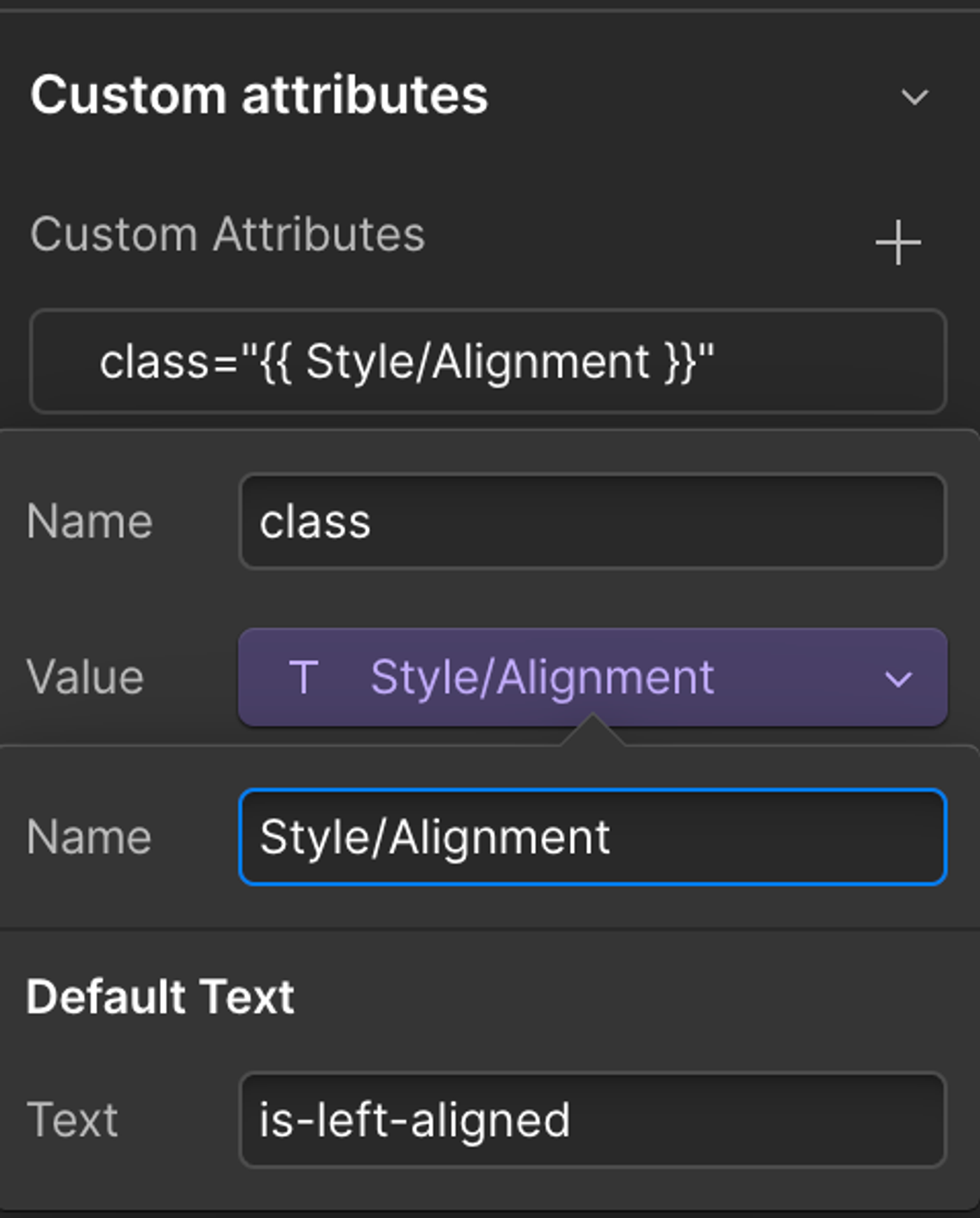
How this works can be a little confusing since classes added in this way do not show up at the top of the styles panel like they usually do within Webflow so you’ll need to follow this workflow:
card_wrap is-left-aligned) and apply the styles you want.You’ll notice that as a part of the workflow you remove the class you are going to be adding in the component property, this is because the component property does not override existing classes, it simply adds the class to the element as well. Because of this, if you are making edits and forget to remove the combo class every instance of the component will already have it added regardless of what is in the property field.
This method is great because it is using the Webflow style panel so you don’t need to remember how to write more complex CSS like flex alignment and justification and can quickly apply styles to a particular element. Its also important to note that you can bind the same property to different elements and have them be affected differently. In the above example maybe the card_wrap changes its flex alignment but you also have a card_text_wrap that needs to change text alignment. You can bind the property to both of those elements class attributes and changing the property value with apply the class to both elements.
Benefits
Main Downsides:
Best used for:
The third option is only available on custom elements but is similar to the second option. Instead of using the class attribute you’re using the style attribute, and rather than adding a class to the element it will write inline CSS styles meaning you can hypothetically override anything about the element on the go. In most cases you are wanting to use the style property to control a specific css property like max width or alignment, but the property can also be used to apply other CSS attributes if the person knows how to write CSS.
Because of this, the style attribute is the most flexible option but with that flexibility comes danger of it being misused. I would recommend using this option only if the first two options won’t work well for the style you are needing. It is also important to well written property names and default values for these fields. For example if you want background image to have an overlay with customizable opacity I would name the property Background Visual/Overlay Opacity and set the default value to opacity: 0%; so that it is easy for users to change the opacity without having to remember the proper syntax.
Benefits
Main Downsides:
Best used for:
It is also important to note that depending on what framework you use each of them will work a little differently with components. Each one will have different utility classes you can use and some come with built in attribute support for certain variables. When working with components the framework that gives you the most built in control is Lumos, but if you’re curious about other frameworks I have a blog post comparing the most popular webflow frameworks out there and describing their pros and cons.
Whatever framework you are using I would recommend using variables to style your components whenever possible as that helps your site become much more managable. If you change a webflow variable value and it updates relevant component style properties without you having to worry about updating them manually, thats a win.
As we’re nearing the end I did want to mention that Components are still a feature that is continuing to evolve in the Webflow ecosystem and because of this more changes are definitely coming down the line. I’ll do my best to keep this post updated but its good to keep an eye on the latest webflow releases as they pretty consistently are improving things. Hopefully down the road Webflow will even release a more ‘native’ way to create different component variants but for now these methods are a huge help when it comes to creating component libraries that have built in flexibility.
With a combination of these three methods you can now create components that have more controls and options within each instance. Hopefully this has been a helpful guide and you’re ready to dive into the deep world of component creation in Webflow. If you’re interested in learning more check out my post on: Modular Component Libraries in Webflow. And feel free to check out the cloneable below if you want to see component style properties in action.
Learn best practices for creating component libraries in Webflow including tips on the new Webflow Slots feature
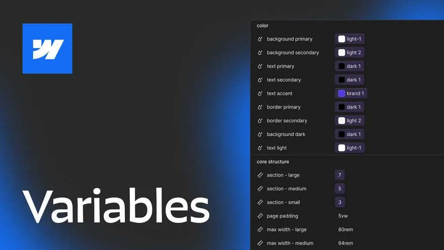
This post explores 2 main approaches to using Webflow variables and covers how you can use different layers of variables, strategies for naming, how to approach color systems and more.

Now more than ever there are a lot of amazing Webflow frameworks to choose from but it can be hard to decide which one to use. In this post I explain the approach, pros, and cons of my three favorites (Client-First, MAST, and Lumos) to help you better understand how to decide on which framework to use.