
Demented
January 2020
The Challenge
True crime isn’t simply horror
When the founder of Demented Clothing first approached me asking if I could create their brand identity I was intrigued. While I’ve never been a true crime junky myself, I was interested in the appeal and started to do some research into what this genre is all about. While there are a lot of interesting podcasts and movies, I found the apparel side of the “Industry” quite lacking. On one hand there was lots of clothing with cliché and uninteresting copy like “the husband did it” and other equally un-inspired phrases. On the other was the hardcore goth aesthetic that appealed to rebellious teens, and not really anyone else.
The Solution
Gritty and historical
In our initial strategy meeting I brought this up with the founder and told her that I thought there was a large gap in the market where Demented Clothing could comfortably sit. This meant keeping the dark and gritty side of true crime without overindulging and becoming predictable. I wanted to help her create a brand that felt mysterious and historical, like finding yourself in a 19th century murder mystery that you aren’t quite sure you’ll make it out of. You’re asking what that means for an apparel brand? Well let me show you.
Logo
Brooding not macabre
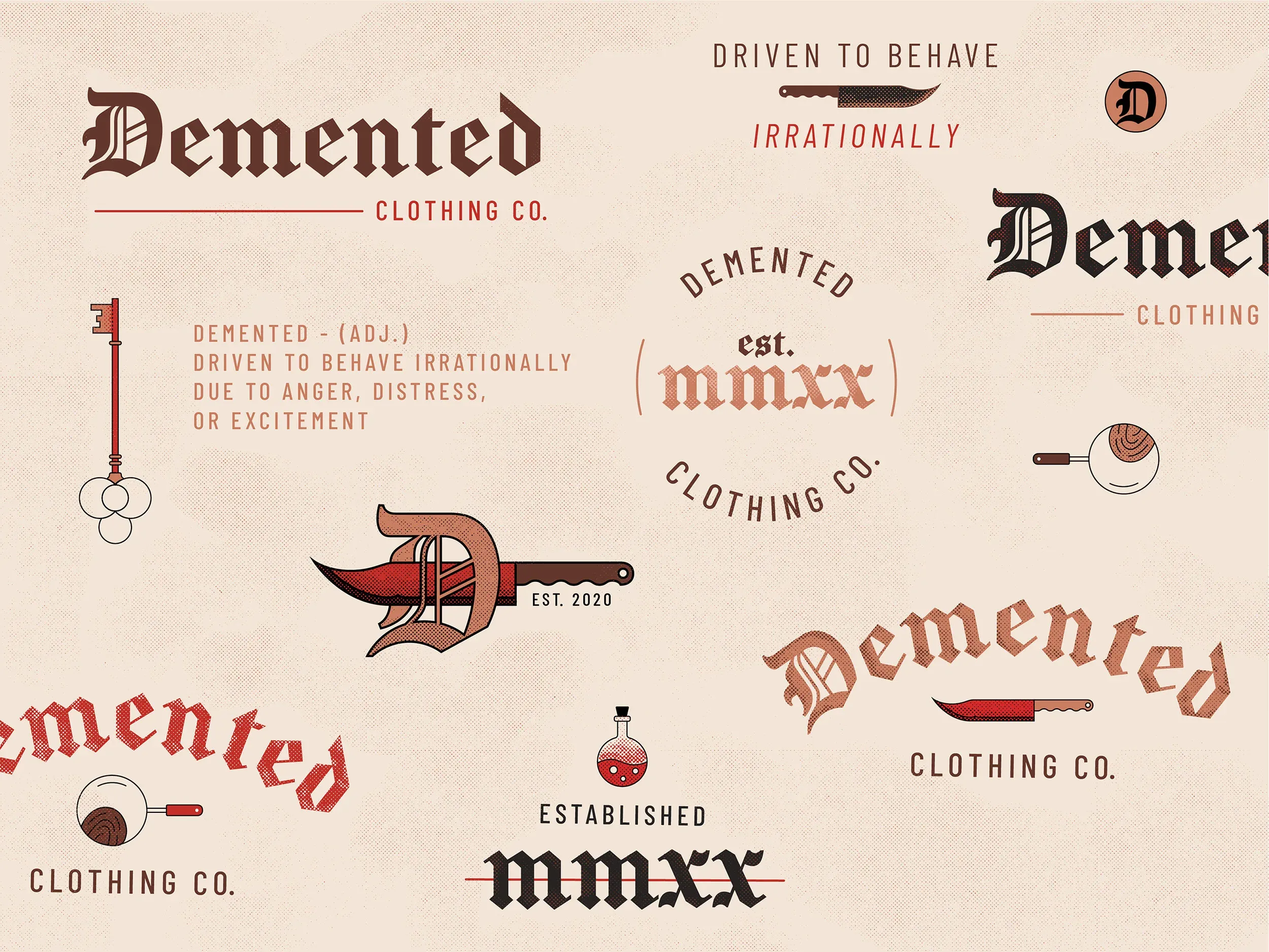
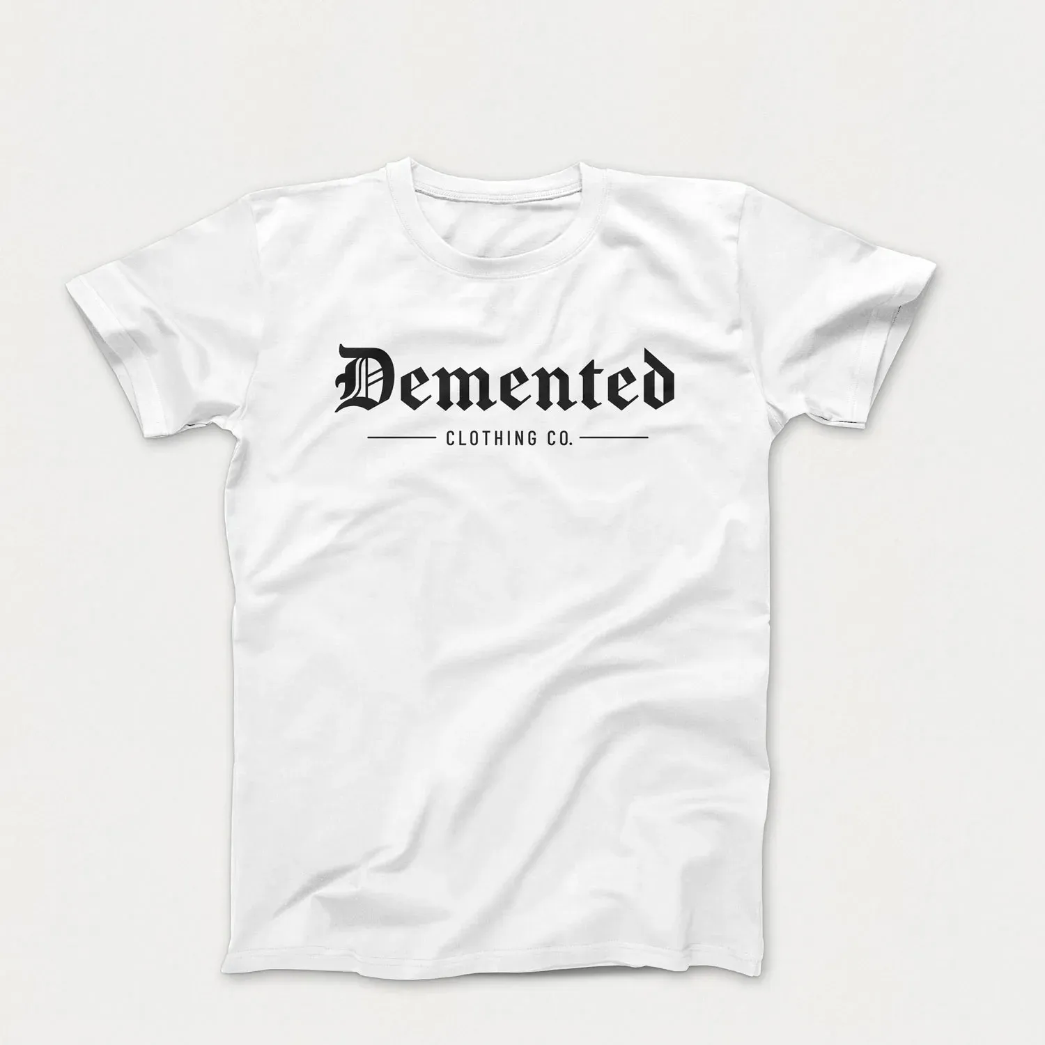
History is a core part of the true crime subculture. There are many instances of killers being inspired by infamous criminals of the past, and some of the most famous serial killers lived hundreds of years ago but are still well known today. Because of this I wanted to make sure that Demented Clothing’s aesthetic felt connected to this history. One of the first ways I did this was by using a blackletter typeface as the starting point for the logo.
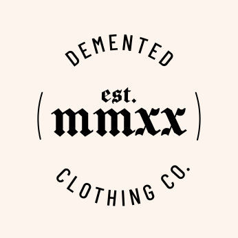
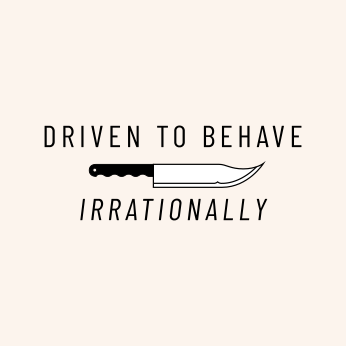
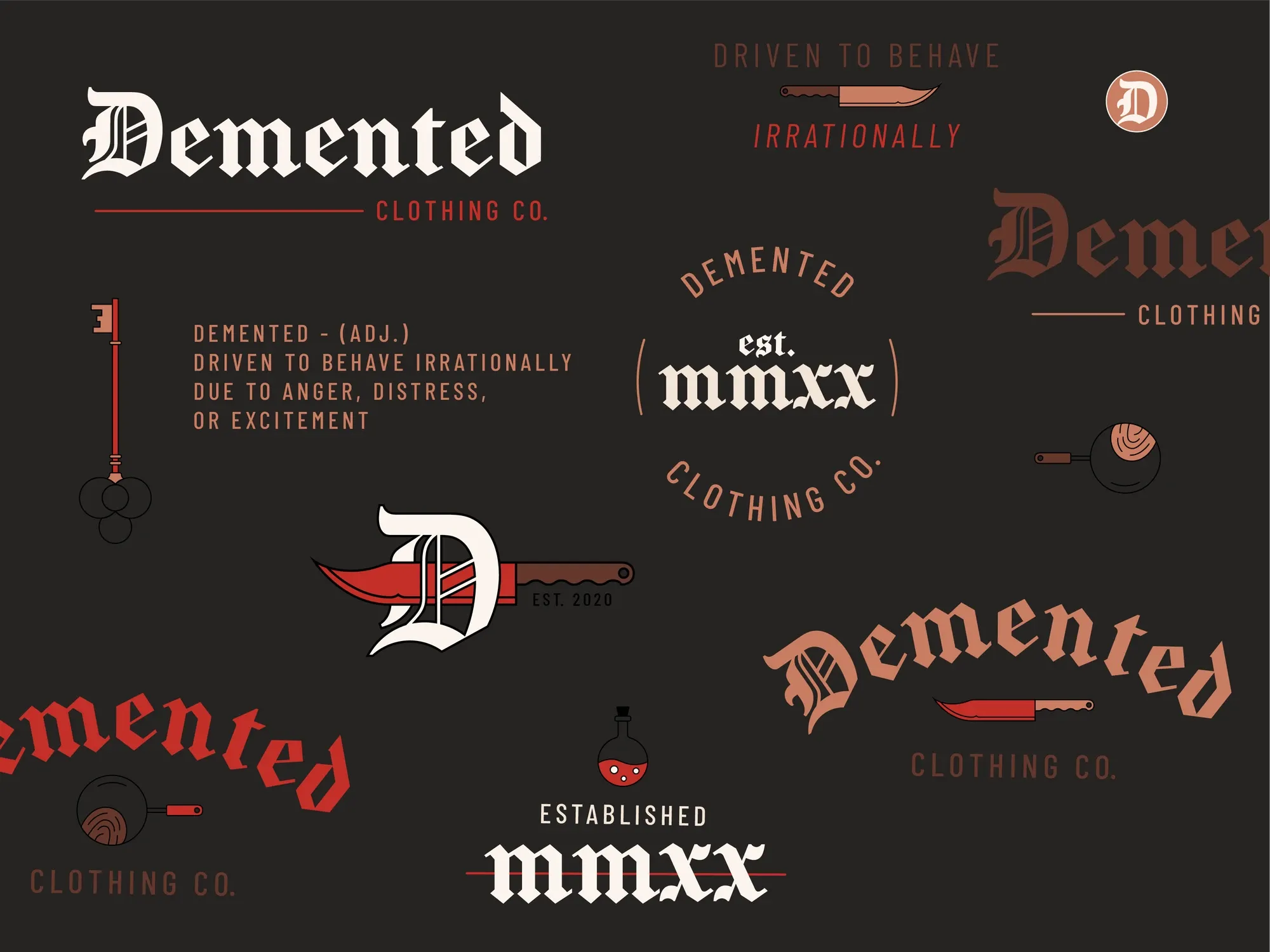
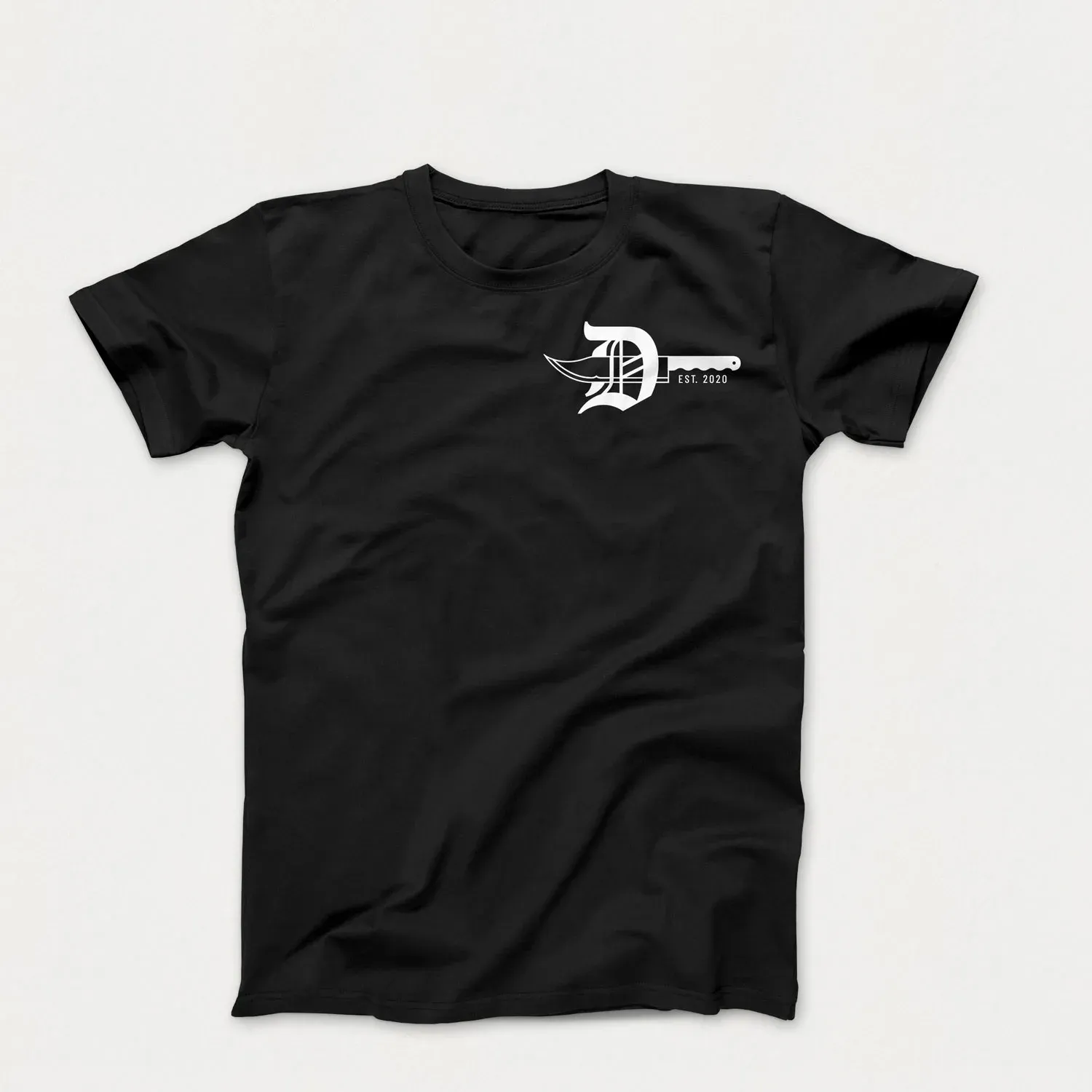
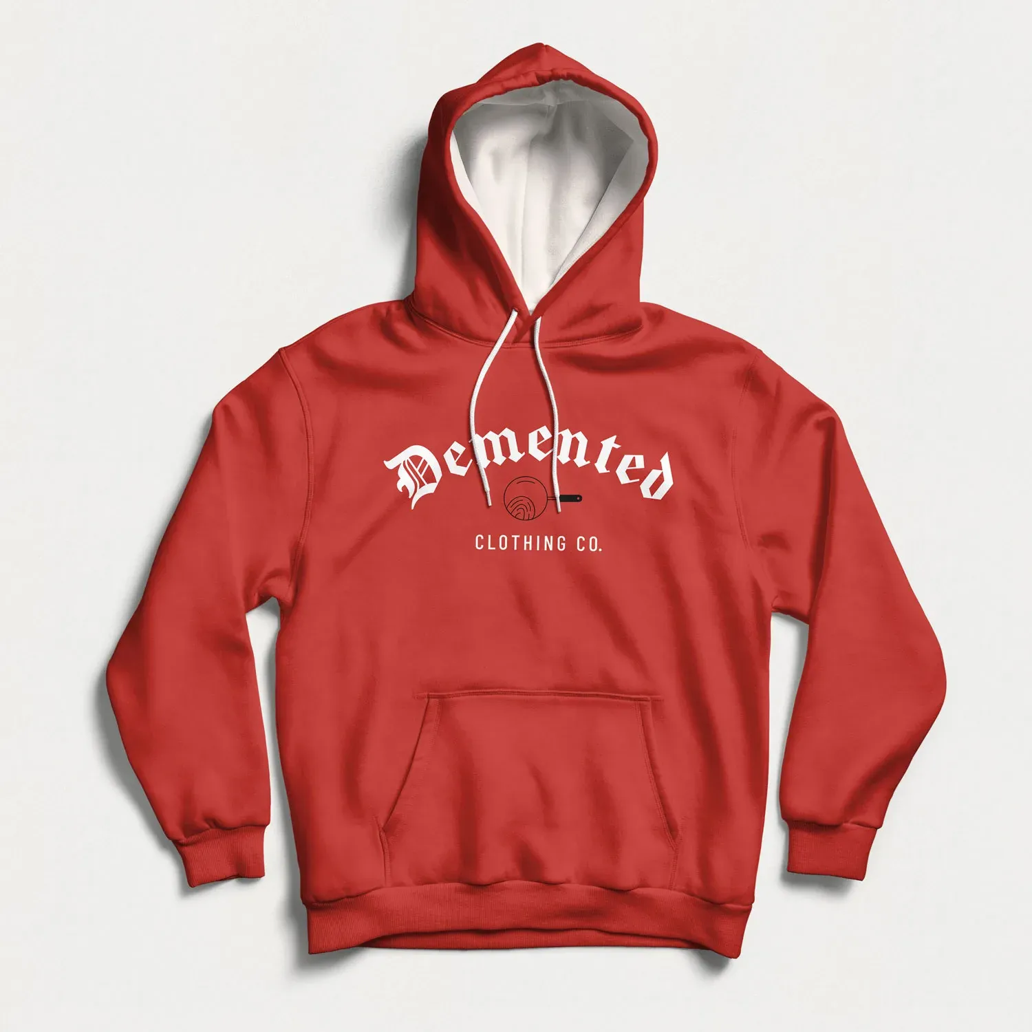
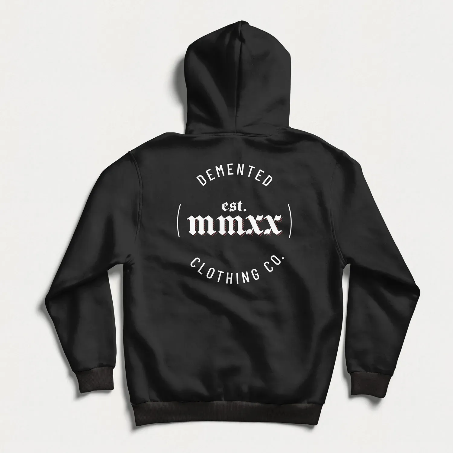
Because Demented is a clothing brand I wanted to have a lot of logo variations as well as other seals and tags for use on various apparel. These gave flexibility in creating clothing designs, allowing for different marks to be used in different situations.



Color
Aged to perfection
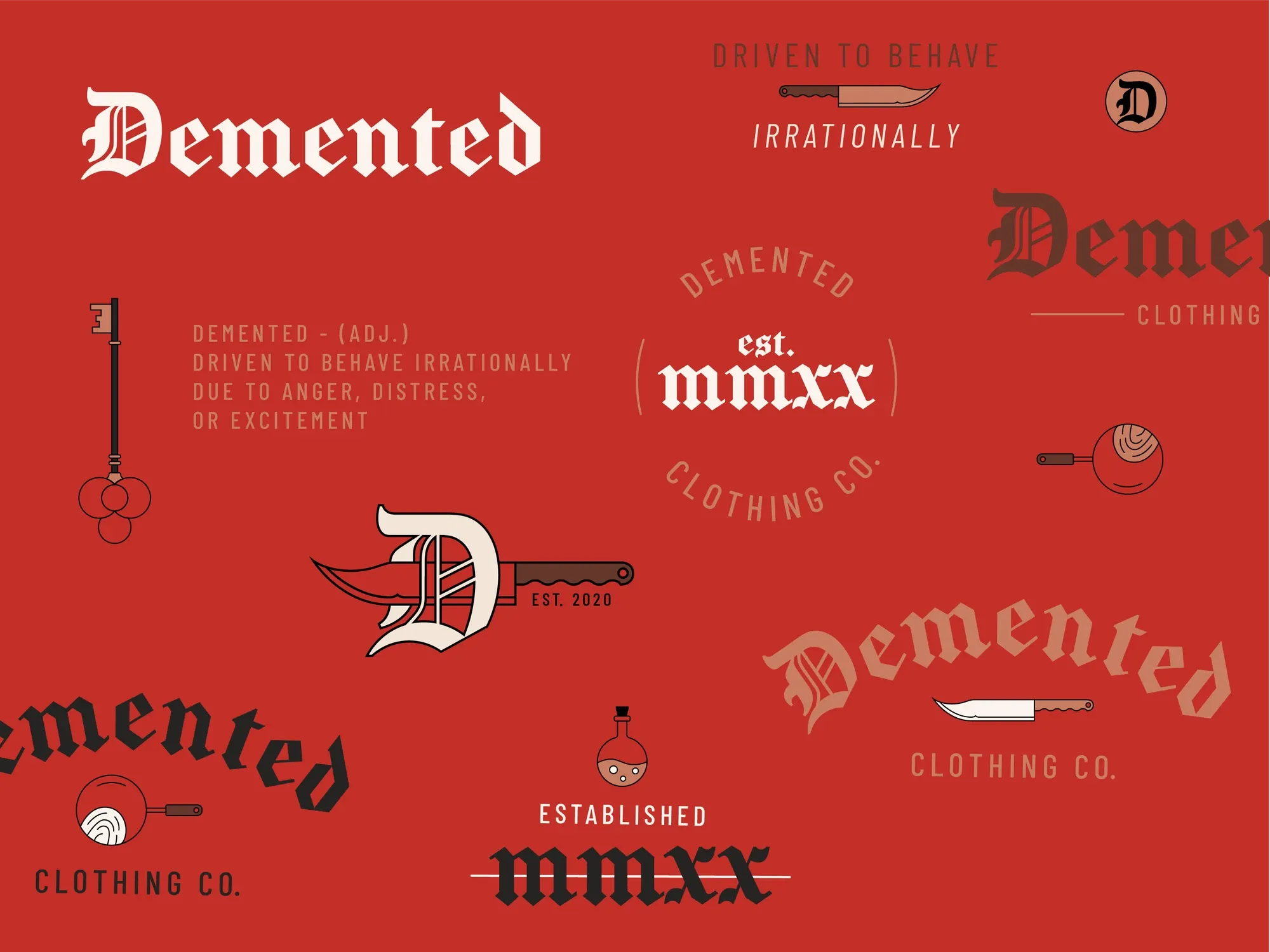
I wanted the color palette to feel dated and worn, so I went for a range of browns supplemented with a strong and dark red (duh). These colors were chosen to be a solid starting point for apparel but were not meant to overly limit designs down the road.
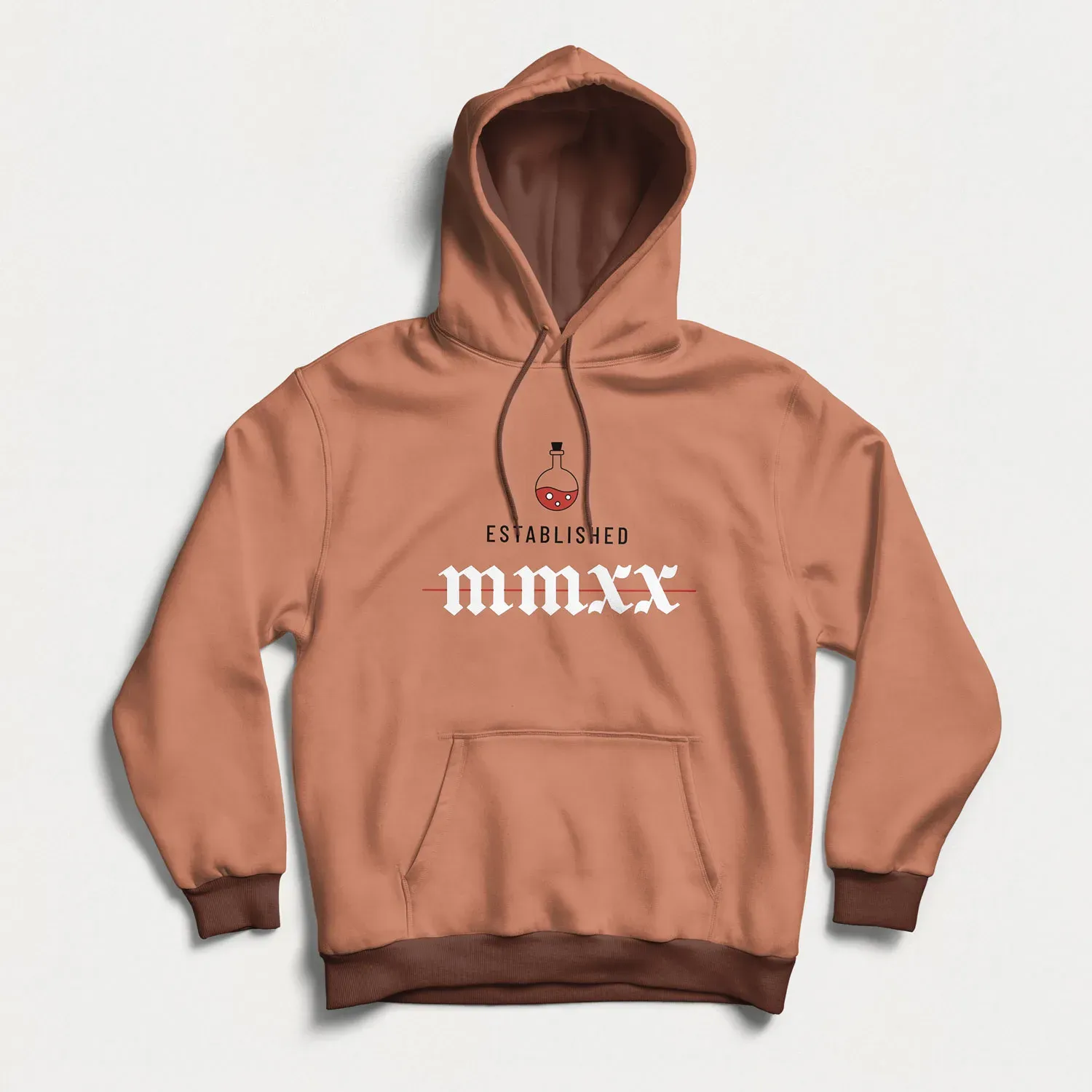
An important aspect of the color palette was making sure that it allowed the logo and assets to adapt well to different backgrounds. I didn’t want the logo to be stuck in one or two colors, but to adjust to fit the clothing.
- #262322
- #c97d61
- #c32f28
- #fcf4ed
Type
Sharp and focused
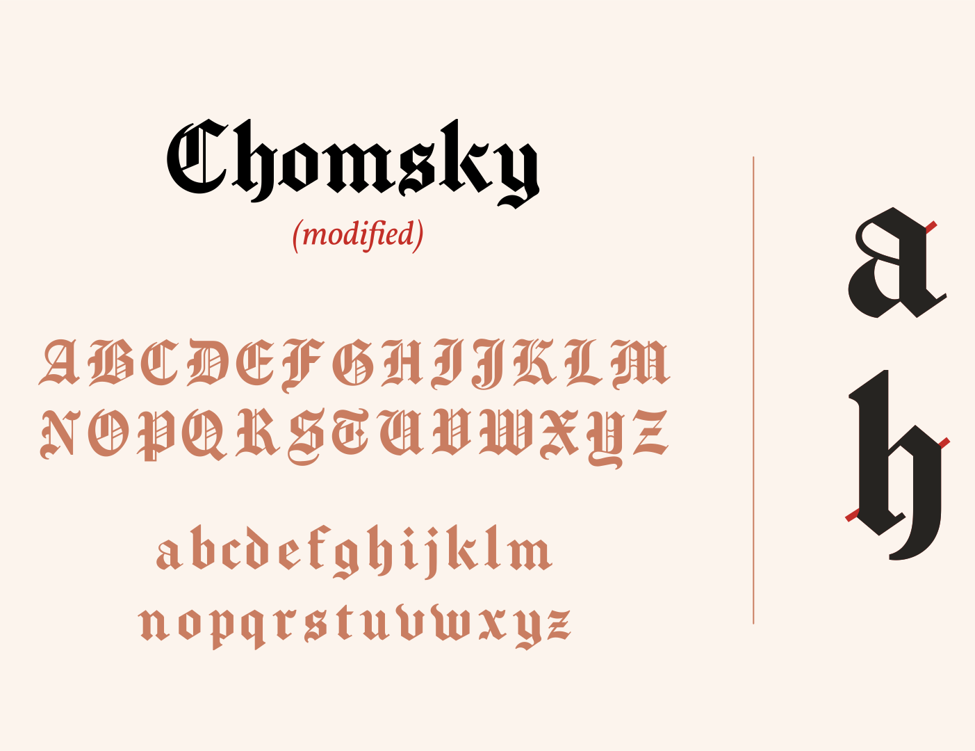
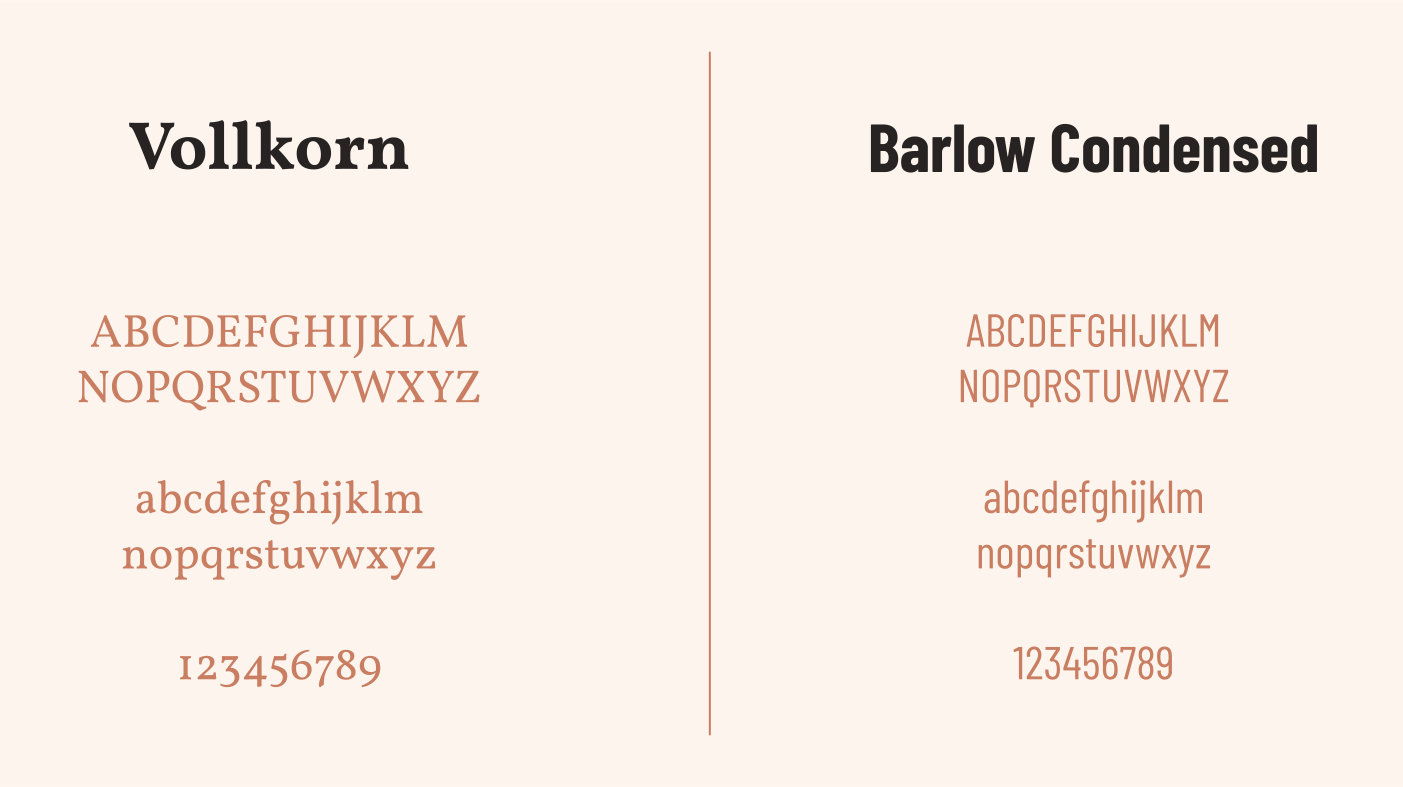
The logotype and primary typeface for headers and apparel is a modified version of Chomsky. I removed some of the extra ears and other details in order to enable it to work better in smaller sizes. Along with this I used Barlow Condensed and Vollkorn for some added versatility.
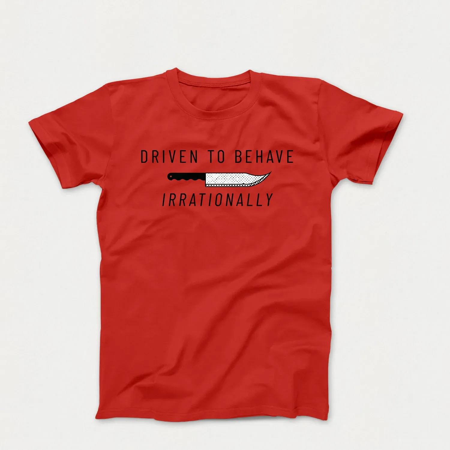
For Demented Apparel, type can be used as a graphic accent on designs conveying facts or details about past events. On clothing designs one can branch out into other fonts that better represent the particular detail or timeframe (early digital clocks, typewriters, newspaper ransom notes etc.).
Style
Adding grit
In order to create a more cohesive visual style I established some additional visual guidelines that would help graphics and apparel maintain a more cohesive look and feel. A big part of this was consistently using halftones to add layering to text, illustrations, and photos. Because halftones originated in early printing technology, they felt like a fitting way to tie Demented’s images back to wanted posters and early newspapers.
What Clients Say

Ivella
Next Project
(Click and Hold)