
Allie Orth
January 2021
The Challenge
Three careers, one portfolio
Allie Orth is a graphic designer with a really diverse set of work experience. She wanted a portfolio site that would tie in her creativity and technical expertise.
The Solution
A grid that holds it all
I collaborated closely with Allie to create a unique identity that made her portfolio a really unique experience without getting in the way of her work. We worked together on the identity and website design, and I handled the Webflow development.
Visual Identity
A cohesive grid system
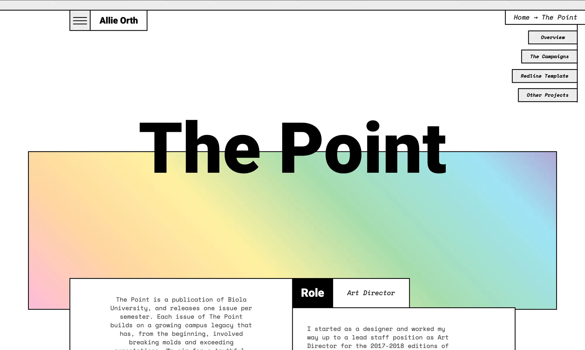
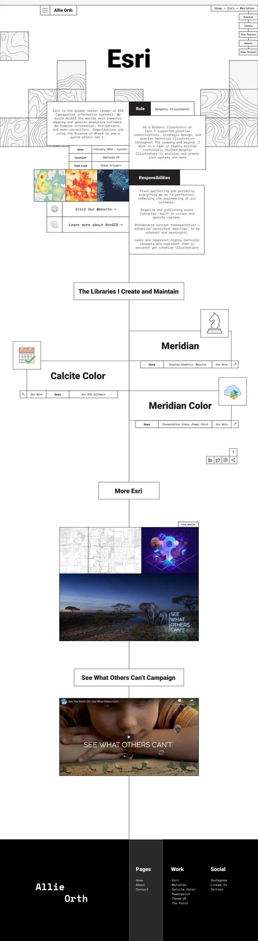
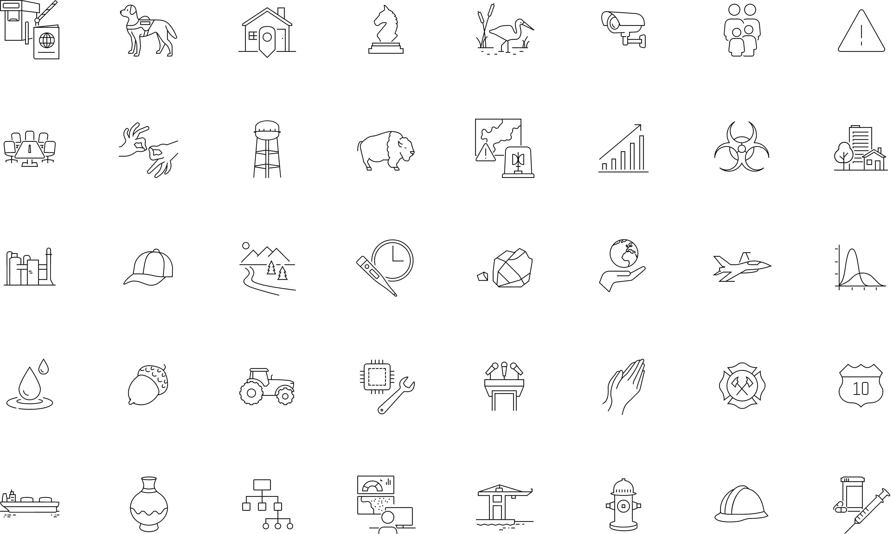
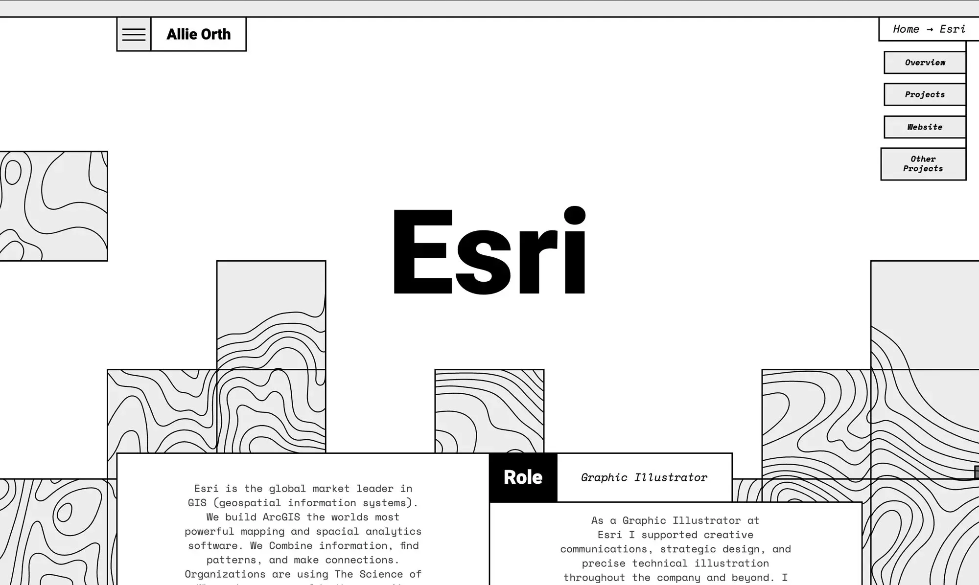
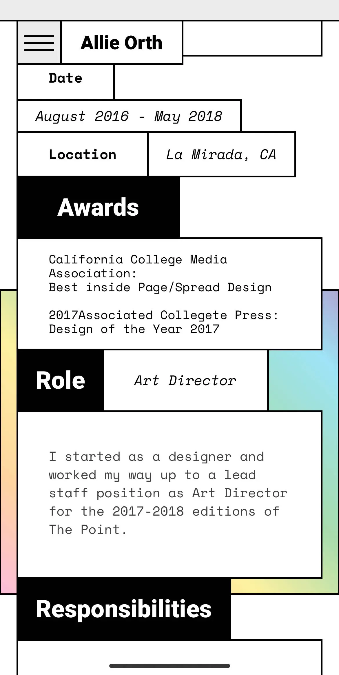
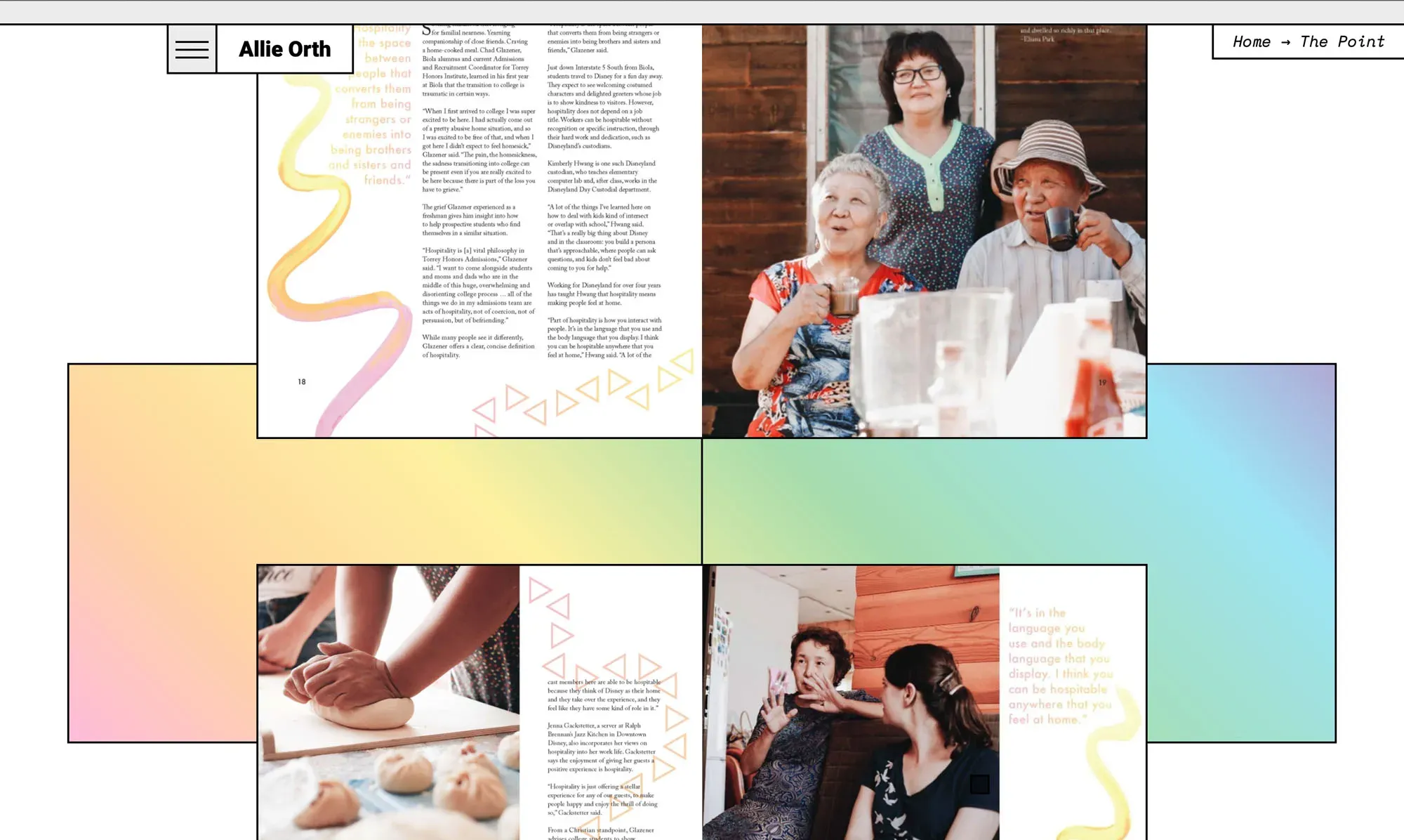
Part of the challenge in creating an identity for Allie's website was finding a visual blend between her three work experiences — The Point (a magazine), ThredUP (an online thrift store) and Esri (a global mapping technology company). What we ended up going with was a robust grid system where everything was placed in boxes with outlines, this kept a technical bent while allowing the graphics from each workplace to be front and center. Along with this we added visual motifs for each of the three companies — a rainbow gradient for The Point, teal dots from ThredUP's brand, and topographical maps for Esri.
Web Design
Creating consistent systems
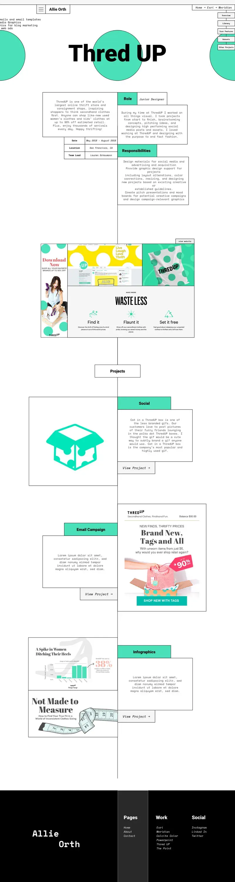
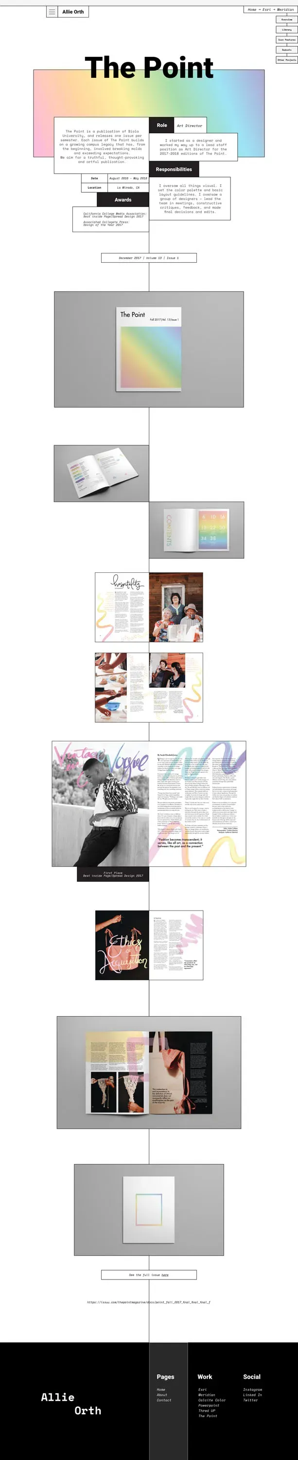
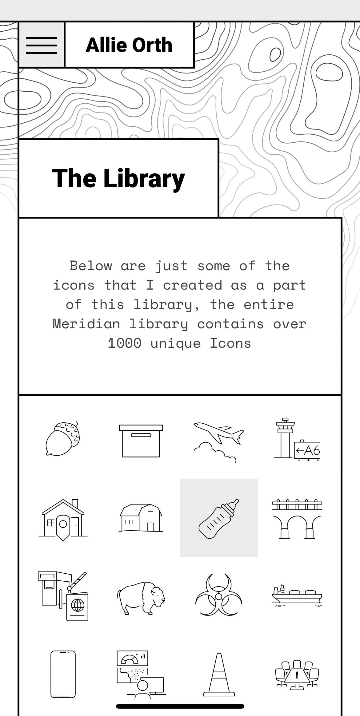
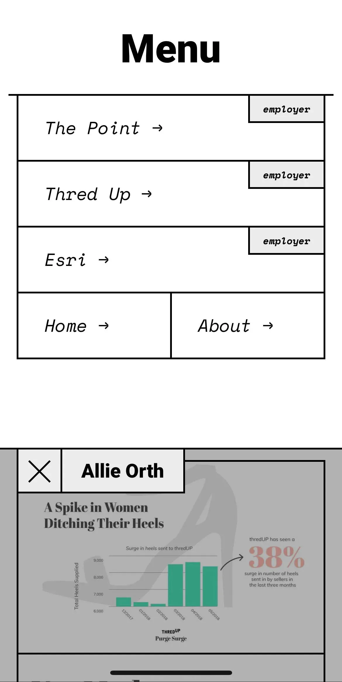
Because I knew development would be a time consuming process we used our grid system to maintain consistent sizes for elements across various pages and also made several tests on mobile designs to see how the more complex layouts could collapse on smaller screen sizes. In order for users to clearly understand the structure we created a menu broken down by employer and then sub-pages for individual projects. Along with this we added a breadcrumb menu on each page to make it easier to navigate.



Development
Clean & methodical
Development ended up being more challenging than expected, it took several tests on my end in order to figure out the best way to create reusable classes for outlines that would align correctly where the lines met, along with that we wanted to add in a custom cursor as well as fun interactions like having the homepage change color and making the boxes draggable. By testing out ideas thoroughly before getting too deep into the build I was able to maintain clean structure and finish the project without any major delays or difficulties.
Linea 7
Next Project
(Click and Hold)