
The rise of component first development in Webflow
As Webflow components have gotten more powerful best practices for building webflow sites are evolving. Learn more about how to build sites with a component-first mindset.
Written By:
Recently Webflow just launched some of the biggest upgrades to components since variants and component slots. In case you missed it here’s a rundown of the new features and some tips and tricks for utilizing them in your latest projects.
Note: These are somewhat advanced features aimed towards making components more powerful, so if you aren’t building sites with a component-first framework now is a great time to push yourself and learn how to do so (here’s a post on that if you’re still getting started).
First off let’s dive into an explanation of the new features.
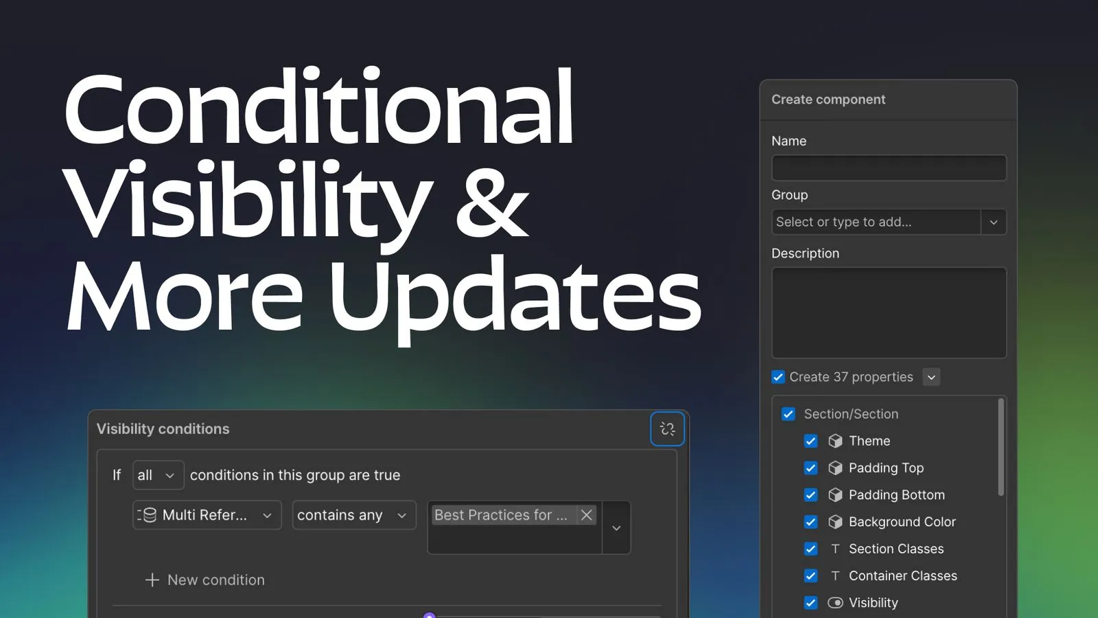
When you create a new component you will now notice that there will be an additional UI toggle allowing you to create “suggested properties” when you create the component. Basically what this will do is search for any components inside the one you are making (along with any text elements, links, images, or videos) and automatically create and bind those properties to the relevant elements/properties. You can also un-check specific properties when you do this to make sure you are only creating the properties you really need. This update also comes with a dedicated component properties panel on the left side of the UI whenever you are updating a main component (whereas before you had to select the outermost component element to access the properties which was a bit of a pain).
Since this is a much more straightforward feature than the other two most of the rest of the article will be focussed on the next two features but this is definitely worth mentioning as I’ve found it to be a major time saver during the beta period.
You can now create custom toggle fields that you can have custom labels for in their “on and off” states, allowing you to use them with a lot more flexibility. This is really similar to the old visibility toggle which allowed you to toggle an element between a Visible and Hidden state within a component, the main difference is that you can use this property to bind it to data attributes and unlock much more complex options with the next feature on the list.
This is a feature that has been on my wishlist for a long time and while it integrates well with the other two features it is by far the most powerful of the three. Basically what conditional visibility allows you to do is to set any toggle field using a set of powerful conditions (listed below). This gives you a ton of control to dynamically show or hide elements based on specific conditions or even setup more custom toggle fields for unique use cases. Each condition can be put into a condition group and you can select between matching any or all of the conditions, and then will have a fallback value if none of the condition groups are met.
The real kicker with this feature is that elements hidden with conditional visibility will not get published on the live site, meaning you don’t have to worry about performance implications of having a bunch of conditionally “hidden” elements getting loaded on a page in a hidden state and slowing down your page load times.
Any of the following component property types:
If the component is on a CMS template page or has a CMS list, you can also use any of the following CMS fields:
As I’m sure you can tell by this list it is a super robust and well thought out set of options and doesn’t leave much to be desired in terms of additional customizability, that being said there are still a few limitations/considerations to know about.
For the suggested props feature while it allows you to rename property names when you are in the component creation UI, you can’t rename property groups, which means you’ll often have to do that right after making the component because it prepends any nested component’s names to the front of the group name. This definitely isn’t a huge issue but does slow things down a bit (this is still much faster than the old workflow though).
If you are using toggle fields to set data attributes (which is one of the best use-cases for the new toggle field outside of setting visibility) it’s important to note that the value of the toggle won’t match the “visual label” you are setting on the site, instead it will always set a value of “True” if on, and “False” if off. While this makes sense from a backend perspective it’s important to note that the first letter of the boolean values are capitalized, so just be aware of this as you are building and make sure to check for case insensitive values in CSS or JS if need be.
I’m not sure if this is just a bug that will be patched later or an intentional limitation but if you have components that have visibility fields already setup and you are wanting to create a conditional visibility requirement for an element, those old toggle fields will not show up as options for setting up the conditional visibility. Eg (if you’re wanting to show a video in a component if an image is set to hidden, you won’t be able to do that unless you delete the current image visibility toggle and make a new one within the same component), which could be an issue if you already have a large component driven site.
While this is understandable because it would be a much trickier feature to create it’s important to note that you can’t setup conditional visibility based on if a slot has any elements within it (or if there are specific components within a slot). While this would definitely be useful it’s not a part of the current update (maybe it will get added down the road).
While this limitation isn’t directly because of this update it’s worth noting because at this point this is the only limitation (that I can think of) that will force you to unlink a component (and drag the section/element outside of a page slot). While I personally find this limitation much less of an issue than the lack of conditional visibility was, it will still affect you if you have robust CMS collections on your site.
I will say there is a bit of a workaround you could use for this issue with some of the new conditional visibility options in some simpler multi-reference cases (eg, Blog posts that need multiple category tags, but the list of tags is not getting updated frequently). But I’ll explain this in detail later on.
Now that we’ve covered how these new features work and what their current limitations are let’s jump into some cool use cases you can use these new features in.
While this is one of the more straightforward use-cases of these new features it’s probably the one that’s going to be the most used in my websites. Previously if you had something like a blog card component and only wanted to show the category tag if the category reference field was set you needed to unlink the Blog Card component in order to set that up, which made component systems with a lot of CMS collections much harder to scale and maintain. You would run into the same situation for CMS template pages, meaning in all but the simplest use cases you wouldn’t be able to use section or layout level components on those pages, but now all of those issues have been solved with this update.
If you’re wanting to go one step further, you can now create really advanced CMS template pages and use CMS fields to update layouts. Simply create both the layouts you want with components, (make sure the elements inside them are also bound to the CMS for their content and visibility) and then on the sections or layouts themselves you can use conditional visibility to only show them if a specific field (like a dropdown option) is set.
The amount you can scale this is really up to you, you could make 10 different pages styles and have a dropdown within the CMS allowing the client to pick which on they want and the only downside you’ll have is slower performance in the designer.
Before this update elements set with conditional visibility would still get exported in the published site code, but would just be hidden using specific CSS classes that webflow applied, this meant doing something like this could have significant downsides when it came to your page speed and SEO. Now that issue is fully solved (even for non-component based systems, but component systems are really getting a much higher level of benefit) If you haven’t heard of component first systems in Webflow or or not building sites in a component focussed way you’re missing out on a lot of the power and flexibility Webflow has to offer. I wrote a post heompre if you’re looking for somewhere to get started.
Another helpful trick is being able to inversely control the visibility of elements based on a single toggle field. While this sounds confusing let me explain with an example. In my starter file I had a component setup for plain text with variants for different font styles, visibility settings and optional combo classes. The issue was that sometimes I wanted this component to use a heading tag, and other times I wanted it to use a paragraph tag. In order to accomplish this I had two text elements inside the component (one heading, and one paragraph) both bound to the same text properties, and I would just have the paragraph visible by default. But if I wanted to show a heading it was a two step process, first I’d have to hide the paragraph, then show the heading. This meant if someone used it wrong they could accidentally show two different text elements (or none at all) which was far from ideal.
With this new update I was able to make a new Toggle field with custom labels (Heading or Paragraph) and then set conditional visibility on each text element to only show if the toggle was on or off respectively. This made the UI cleaner, and prevented the possibility of accidentally showing multiple text elements within the component.
Another extremely powerful option is the ability to show or hide elements or nested components based on what variant a component is using.
For example, if you have a card with an image and heading, and you want a variant where the image is on top of the text, and a variant where the image is behind the text you can easily set that up using component visibility.
You might be thinking (well I could do that before with component variants by just making a new variant and then modifying the CSS of elements inside that component). The issue with this was twofold:
Since conditional visibility won’t render elements on the live site you can use this feature to target custom CSS selectors and/or trigger Webflow interactions. If you’re curious how to do this (and a couple other use cases I’ve mentioned) I’d recommend watching this Timothy Rick’s tutorial.
One niche use case I tested was that you can also do a bit of a hacky workaround for nested CMS collections in some cases. For example: if your site has a blog and you want to be able to tag posts with multiple categories, but your categories are pretty static (eg, News, Press, Opinions, Resources). You could solve for this within a component using conditional visibility.
The first step would be to manually create a tag for each of the categories within the CMS Blog Cards component. The next step would be to bind the visibility for each tag individually based on a condition like “Multi-Reference Categories contains Category Name”. This would allow you to show tags for multiple categories within blog cards without having to unlink the component and drop in a nested CMS list.
Two large caveats to this method are:
Because of these reasons it’s best to only use this workaround in specific circumstances like the one I described above but it could definitely be a helpful workaround without having to remove page slots and unlink components.
Since this is a really new feature there may be more I haven’t discovered yet, so feel free to reach out if there’s something I missed in terms of features or unique use cases. Personally I’m really stoked for the things this is going to unlock in my workflow, and I hope that after reading this you can realize how powerful this update is for component driven design systems in webflow.
As Webflow components have gotten more powerful best practices for building webflow sites are evolving. Learn more about how to build sites with a component-first mindset.

Now more than ever there are a lot of amazing Webflow frameworks to choose from but it can be hard to decide which one to use. In this post I explain the approach, pros, and cons of my three favorites (Client-First, MAST, and Lumos) to help you better understand how to decide on which framework to use.

Learn how to change layouts, colors, and more within single components using visibility overrides and a bit of custom CSS.